How to Coordinate Outfits for Your Wedding Party Without Clashing
The "Rainbow Nightmare": Why Your Wedding Photos shouldn't Look Like a Bag of Skittles
We’ve all seen those wedding albums. The bridesmaids are wearing neon pink, the groomsmen are in electric blue ties that don’t quite match, and the family members in the front row are sporting a chaotic mix of patterns that makes your eyes hurt. Instead of focusing on the happy couple, you’re distracted by the visual noise.
Coordinating outfits for your wedding party—and your immediate family—is one of the most underrated challenges of wedding planning. You want everyone to look cohesive and elegant, but you also don't want them to look like they are wearing identical uniforms. The goal? A curated, harmonious aesthetic that makes your photos look editorial, not accidental. Here is how to style your squad without the stress.
1. Pick a Palette, Not Just a Color
The old-school rule was "everyone wears Royal Blue." The modern, chic approach is to pick a palette.
The Strategy: Choose a spectrum of shades within the same family. For example, instead of just "purple," give your bridesmaids a swatch card ranging from lilac to lavender to deep plum.
Why it Works: It adds depth and texture to your photos. Plus, it allows each person to pick a shade that actually flatters their skin tone, making them feel confident and happy (which shows in pictures!).
2. The "Bridge" Accessory
If you have a mix of Western suits and Indian ethnic wear (Sherwanis or Kurta Pajamas), things can look disjointed fast.
The Strategy: Use a "bridge" accessory to tie the two groups together. If the bridesmaids are in sage green lehengas, have the groomsmen wear sage green pocket squares or ties with their suits.
The Detail: Even small details like matching boutonnieres or turbans (Safas) can unify a group that is wearing completely different styles of clothing.
3. Don't Forget the Textures
Color isn't the only way to clash; fabric matters too. A shiny satin dress next to a rustic linen suit can look jarring.
The Strategy: Keep the "vibe" consistent. If you are having a formal ballroom wedding, opt for silks, velvets, and structured fabrics. If it's a beachy or garden wedding, go for chiffons, georgettes, and lighter cotton blends.
The Rule: If the groom is in velvet, the bride shouldn't be in casual cotton. Match the formality level across the entire party.
4. The "No-Pattern" Rule for VIPs (Unless Curated)
Patterns are risky. One loud floral print can dominate a group photo.
The Strategy: Generally, advise the immediate family (parents and siblings not in the wedding party) to stick to solids or very subtle self-prints.
The Exception: If you do want patterns (like floral sarees for the bridesmaids), make sure they are from the same collection or designer so the scale of the print matches.
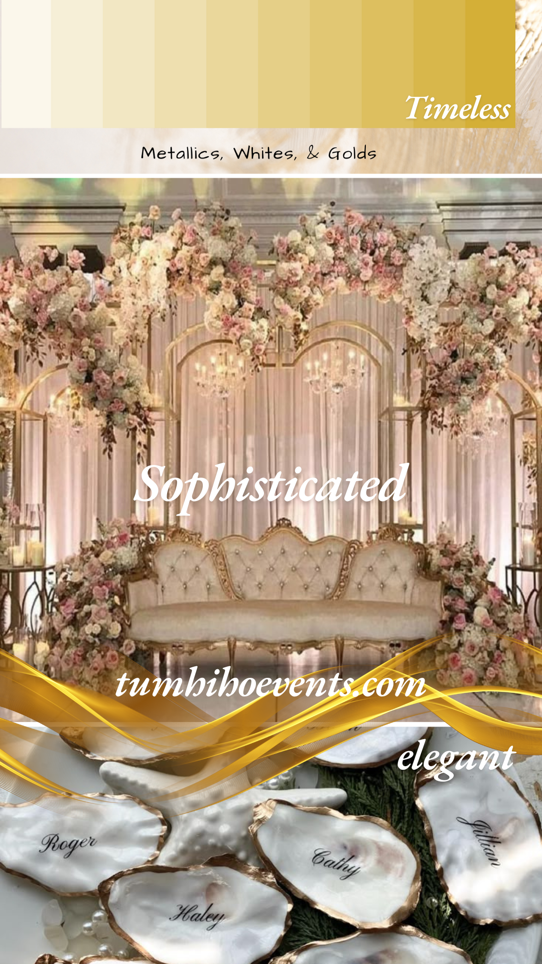
Image credits: A metallic color theme development drafted by Tum Hi Ho Events. We can help you design a wonderful wedding theme - reach out to us!
5. Create a Visual Guide (The Mood Board)
Words like "Gold" are subjective. To one person, it means "Champagne," to another, it means "Yellow Canary."
The Strategy: Don't just tell them; show them. Create a simple Canva mood board or a Pinterest board that you share with your wedding party and family.
The Inclusion: Include "Do's and Don'ts." For example: "Do wear: Jewel tones, Emerald, Ruby. Please avoid: Neons, White, Black."
Conclusion: Cohesion Over Uniformity
The best-dressed wedding parties don't look like clones; they look like a collection. By focusing on a cohesive color story and respecting individual styles, you create a visual harmony that elevates your entire wedding aesthetic. Your future self (and your wedding album) will thank you.